
First impressions are important. Especially for a rapidly-growing financial firm considering going public.
Crossfirst Bank, who represent around 1.3 Billion in assets, were taking steps towards an offering but had some initial concerns. Addressing their truckload of brand terminology, clearing up name confusion and evolving an outdated mark were among them.
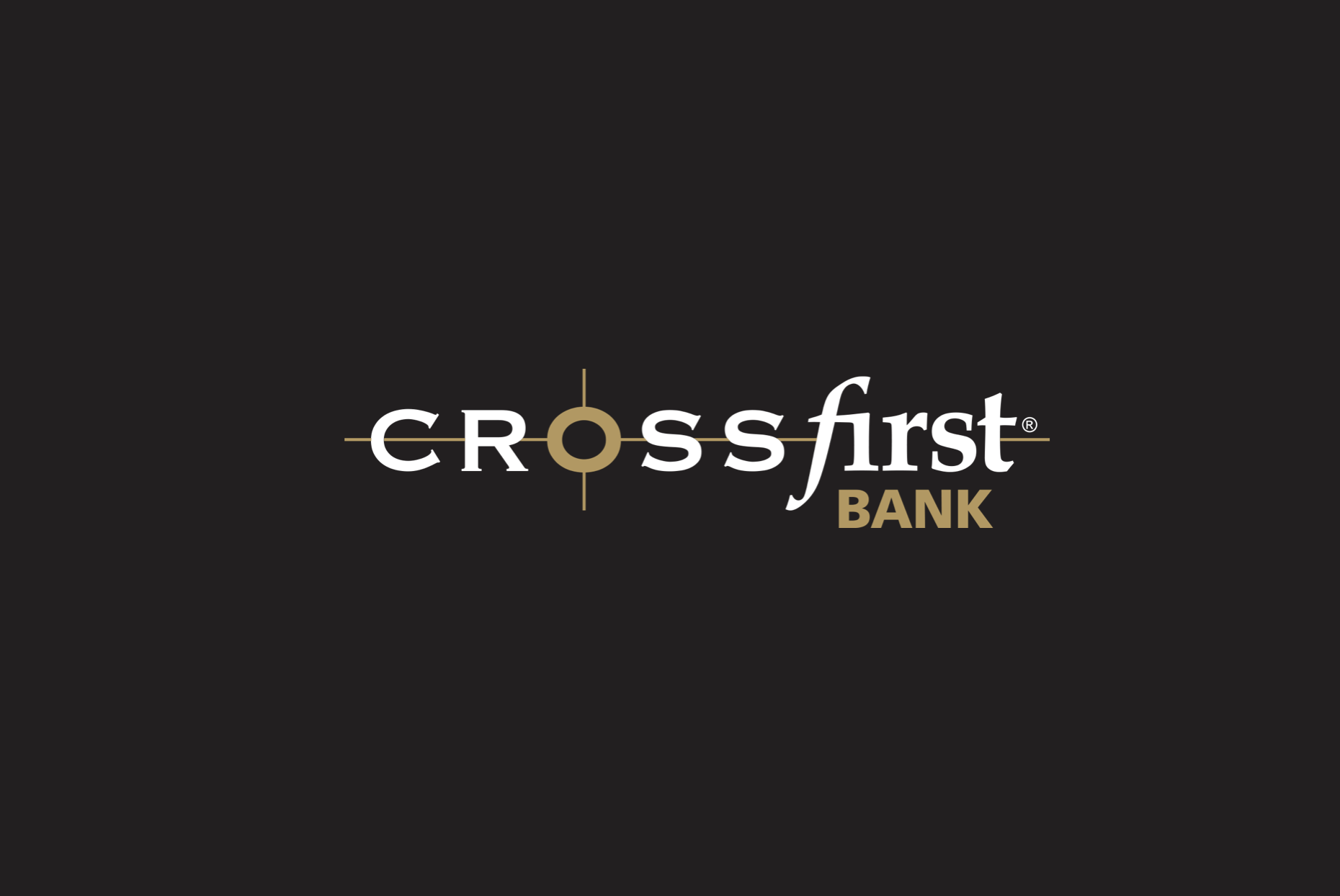
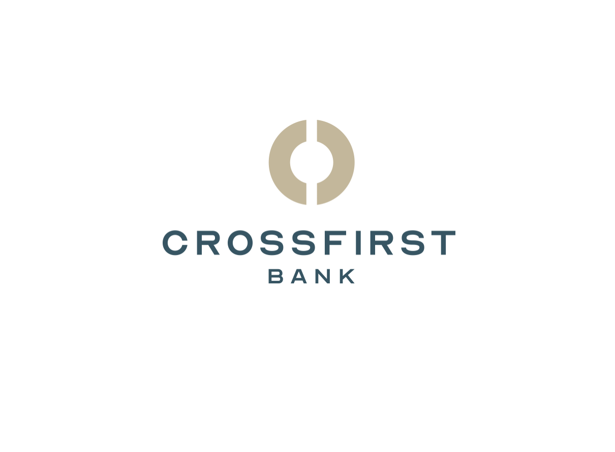
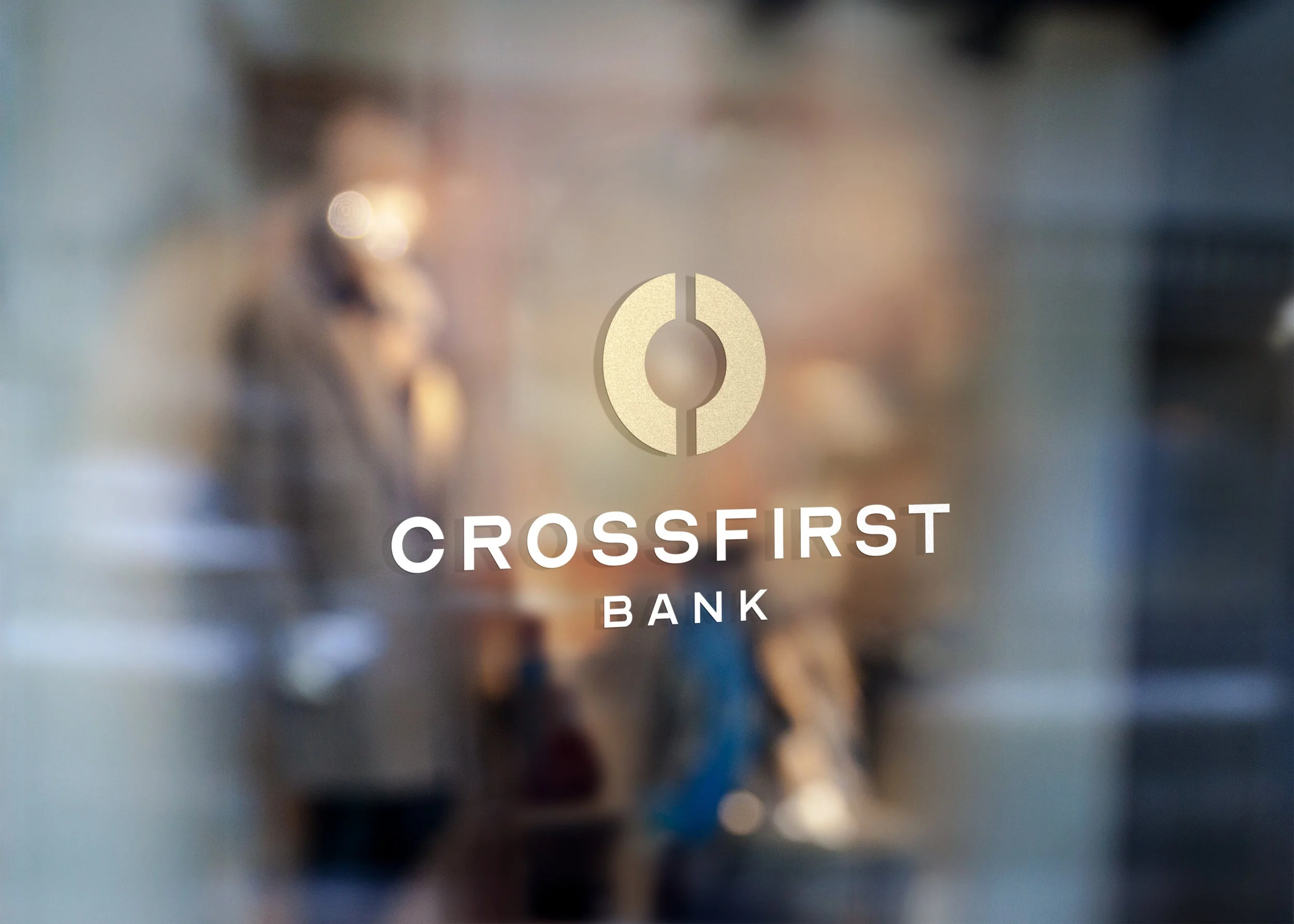
Removal of the Crosshair, simplified typography & purposeful balance allowed for referential, evolutionary progress.
Interviews with key stakeholders led to an insight from a partner who said that banking, at its core, is still a relationship between two people. This insight, along with in-depth analysis of color, typography, language and tonality, led to a simplified brand focused on reflecting their promise of trustworthy client relationships.


