

The country's largest and oldest youth mentoring organization, Big Brothers Big Sisters, was interested in creating a powerful and attractive new identity for their next 100 years.
Declining engagement, relevance and volunteers revealed the need and so work began to peel back the layers, starting at the very beginning in 1904. It was Ernest Coulter, who founded the Big Brothers organization, who believed that children already have unlimited potential and that with guidance, encouragement and love it could truly be unlocked.
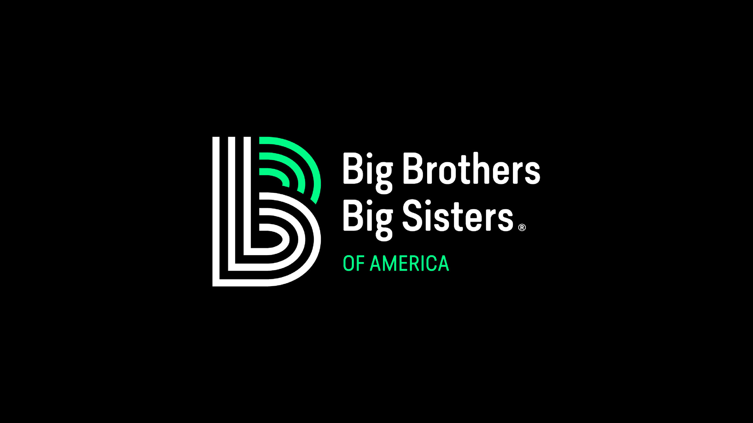
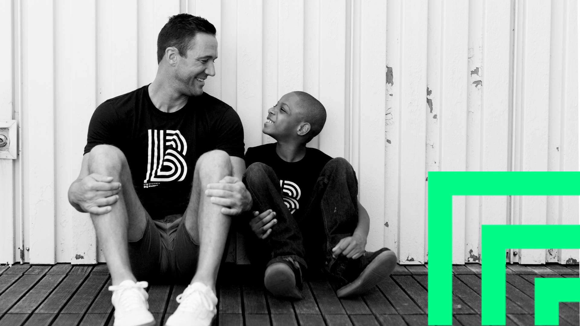
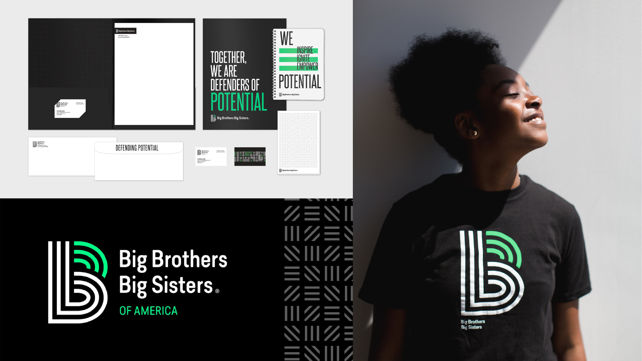
Replacing the former logo (two figures holding hands) is a powerful and bold capital “B”. The new logo is a symbol of the powerful relationships between Bigs and Littles. The little “b,” which symbolizes the Little, is the at the center of the mark, and the green lines that complete the capital “B” symbolize the Big, who empowers the Little’s potential.

The brand overhaul resulted in 90% of the nation’s 240 agencies adopting the new identity and of those agencies 50% saw an uptick in volunteers within the first month. Of those volunteers 88% were men, the intended target audience.

Recently, the brand was honored at The Gathering, a business and marketing summit, as one of the most influential brands alongside McDonald’s, Chobani, UNO, TikTok, NHL Team Seattle Kraken and DoorDash. Big Brothers Big Sisters was the only non-profit to be recognized.